Embrace the Future: Your Orthodontic Practice Needs a Mobile-Friendly Website

It’s time to prioritize your mobile presence!
In today’s fast-paced digital world, your orthodontic practice’s online presence is a crucial component of your success. Mobile-friendly websites have become indispensable, promising accessibility, delightful patient experiences, and a sterling reputation for your practice. In this friendly blog post, we’ll take a closer look at why orthodontists should prioritize mobile-friendly websites and the multitude of benefits they bring.
- Accessibility on the Go: Mobile websites are your virtual business card, available 24/7 on the devices your patients adore – smartphones and tablets. Your potential patients can connect with your practice anytime, anywhere, whether they’re sipping coffee at home, sneaking in a quick peek during lunch, or commuting. This easy access extends the reach of your practice, connecting you with patients on the move.
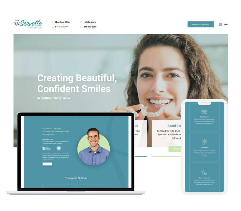
- Smile-Worthy User Experience: A mobile-friendly website is all about making your patients’ digital journey as smooth as possible. No more awkward pinching, zooming, or endless scrolling. A well-designed mobile site elevates user experience, increasing patient satisfaction. Servello Orthodontics utilizes a website that works on any medium; tablet, mobile phone, desktop so no matter where potential patients are looking they get an easy to use experience. With user-friendly navigation, your visitors are more likely to stay, explore, and take that important step of scheduling an appointment.
- Shine on Search Engines: Major search engines like Google have a soft spot for mobile-responsive websites, and they show it by giving them priority in search rankings. Having a mobile site can improve your practice’s visibility, helping potential patients find you with ease. With an optimized mobile site, your orthodontic practice can capture more organic traffic and stand out from the competition.
- A Dazzling First Impression: Your website is often your patients’ first glimpse of your practice. A mobile-responsive design ensures that this first impression is unforgettable. A clean, professional, and easy-to-navigate mobile site builds trust and positive associations with your practice.
- Get Ahead of the Curve: In a field as competitive as orthodontics, staying ahead of the curve is essential. Embracing a mobile-friendly website isn’t just an advantage; it’s a necessity. It showcases your commitment to providing patient-centered, modern care and sets you apart from practices with outdated sites. That’s a competitive edge you can’t afford to miss.
- Lightning-Fast Load Times: Mobile-optimized websites load quickly, even on the shakiest of connections. Your patients don’t have time to wait around for a website to load, especially when they’re in search of critical information or filling out a contact form. Quick load times improve user satisfaction and keep your bounce rates low.

In the digital era, a mobile-friendly website is your orthodontic practice’s best friend. It connects you to a wider audience, offers a fantastic user experience, boosts your search engine visibility, and creates a remarkable first impression. In the fiercely competitive field of orthodontics, having a mobile-responsive site isn’t just an advantage – it’s a requirement for success. If you haven’t already made your orthodontic website mobile-friendly, now’s the perfect time to embrace the future and ensure the continued success of your practice.