How it started?
We set out in creating the brand name, identity and website for the brand new company.
About the practice
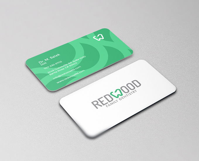
Dr Salek wanted to communicate a warm and friendly environment, where his patients knew they would be taken care of and treated well. Sharing that simple but very important message was all we needed to craft a well-rounded name & identity for the business.
Creating the digital brand identity
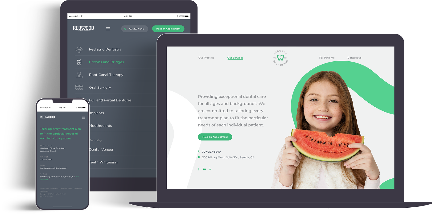
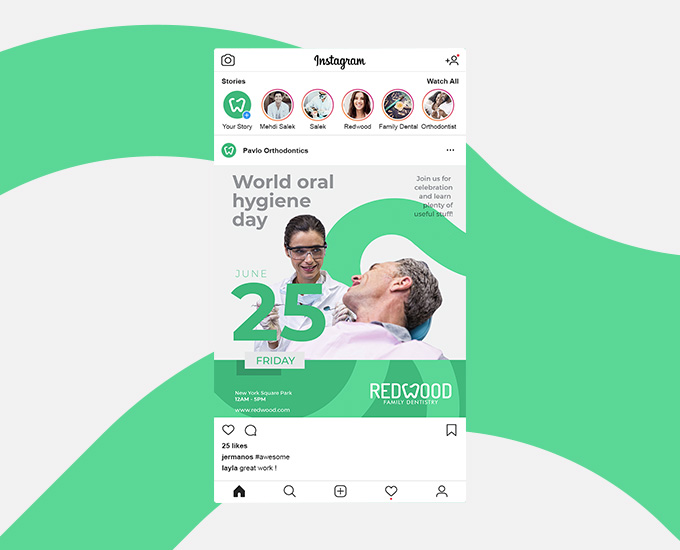
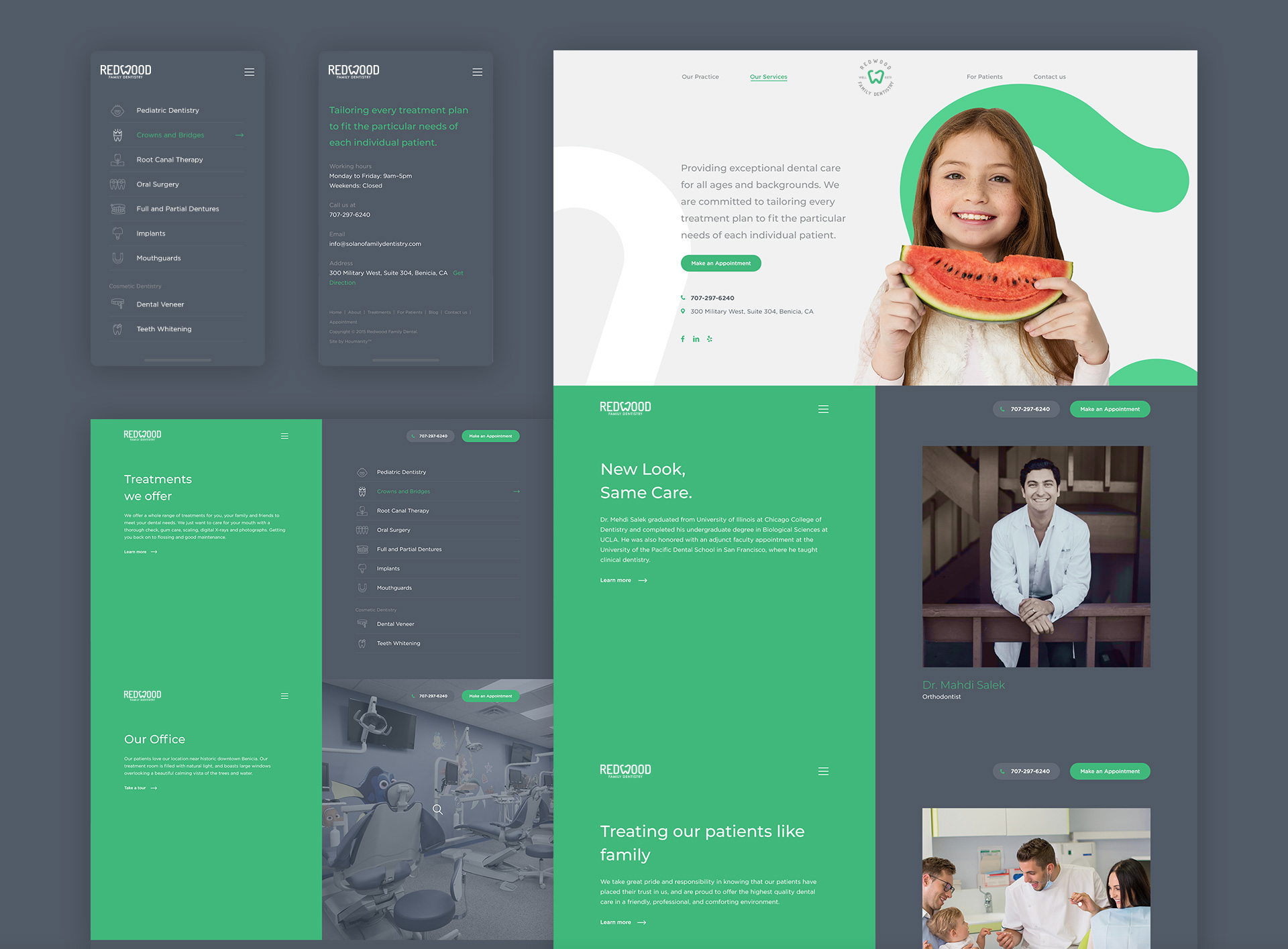
Their intention had to be recognisable from the moment patients viewed any of the brand’s touch points. This naturally translated to the brand’s new website which we built from scratch.
Every page carefully crafted to allow the user to effortlessly browse through and have a seamless experience.

The Challenge
We needed to communicate warmth that patients instantly began to trust the business and the brand can begin to build their reputation. Trust and credibility had to be developed from the moment patients landed on the company’s new website.
So we kept the website simple and familiar, focusing on creating an effortless user experience which would then naturally reflect the service Redwood looks to provide patients at their practice.
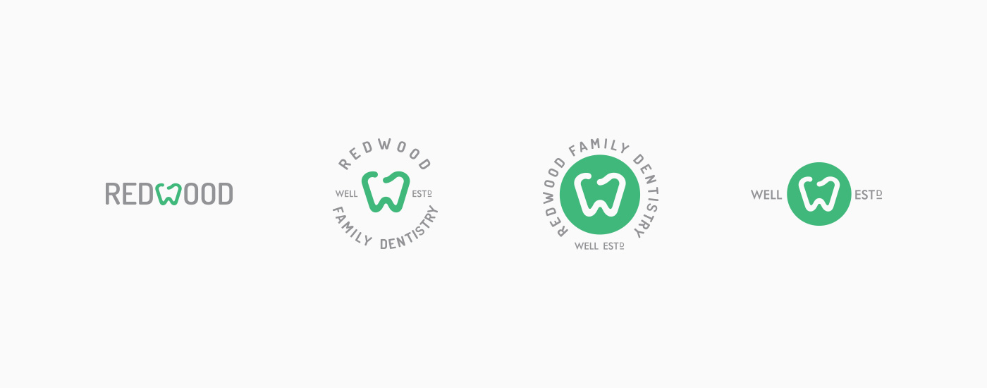
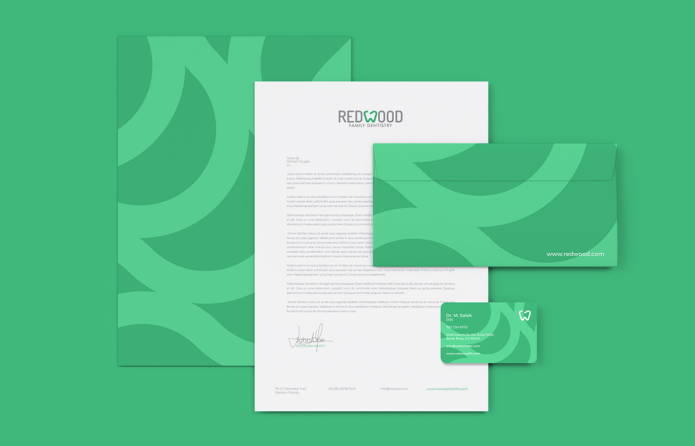
The logo itself is simple and memorable, again focusing on communicating warmth and approachability. It helps project a sense of professionalism and care which only Dr Salek and his brilliant team can provide.
Web Design
Scope of Work
Discovery
- Workshops
- Research
Strategy
- Persona Development
- Information Architecture
- User Experience
Design
- Art Direction
- Web Design
- Visual Moodboards
- UI Design
- Content Creation
- Print Materials
Development
- Frontend Development
- Backend Development
- CMS Integrations
Marketing
- Google Ads
- SEO
- Print Ads