How important is fun?
The world of oral health specialists are not known for delivering an enjoyable experience. A perception leaving many dreading the visit. A fresh approach changes all that.
About the work
Henneberry Orthodontics didn’t let the perception of their industry change who they were. They focus on family. Giving a personalised service. Making everyone feel at home in their practice.
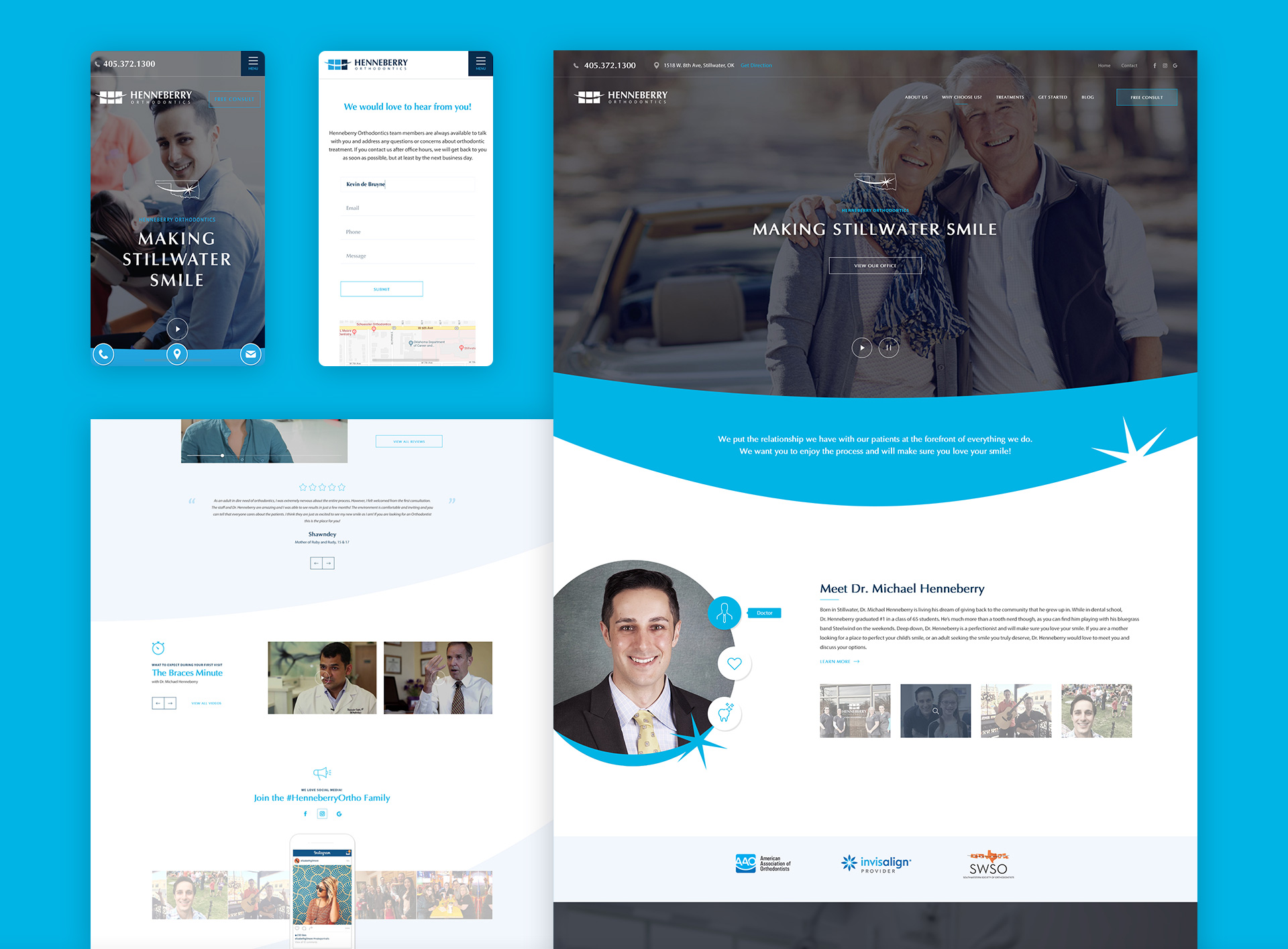
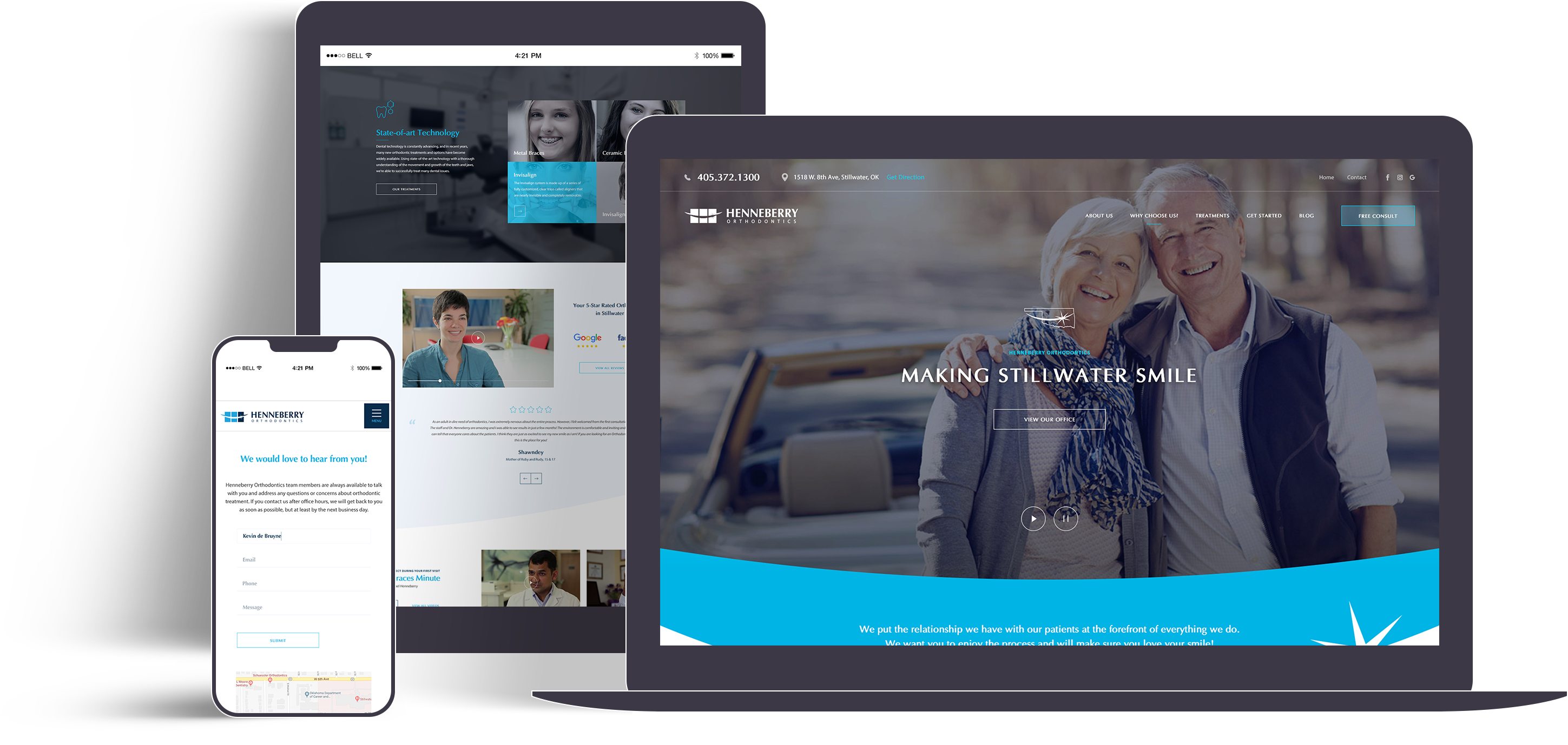
Their problem was all their current clients knew this, but anyone that looked at their website wouldn’t have a clue. The very people Henneberry’s wanted to turn into their regular patients.
Creating the digital brand identity
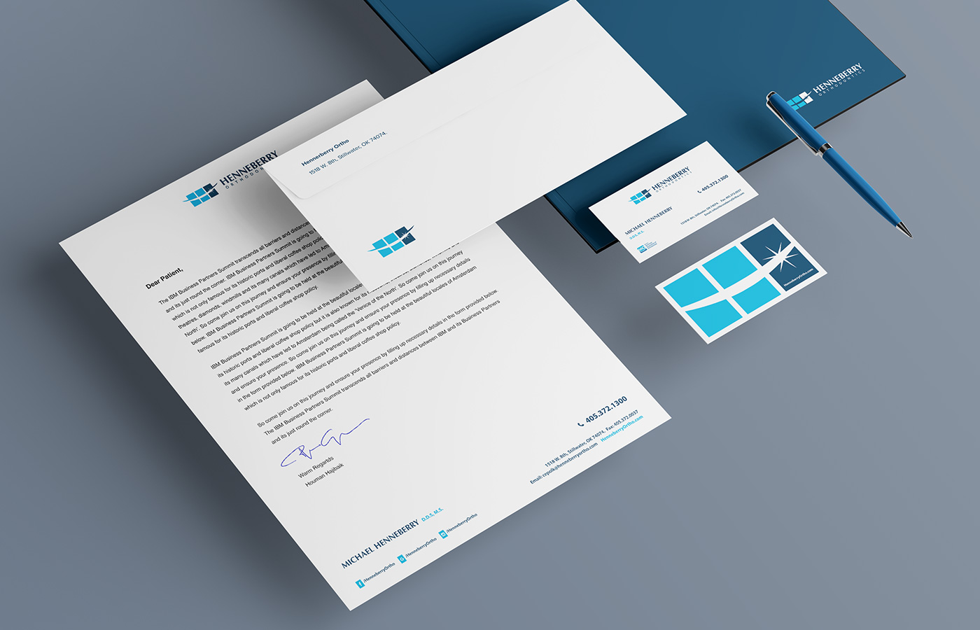
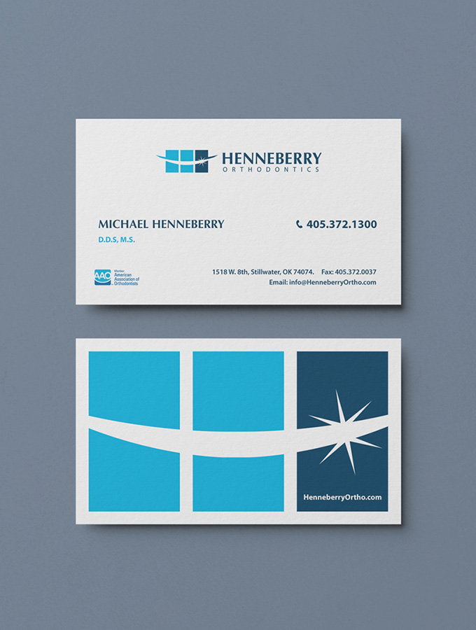
We focused on utilising high energy blues as the main colour palette for the brand, whilst opting for a font which suggested professionalism and expertise. Capturing the practices daily happenings, we managed to develop a range of warm and inviting photography to use throughout the new website to give a sense of what new patients can expect from their visit to see Micheal and his team.
The brand’s new look communicates the personality of the practice, whilst also positioning the business as a trustworthy and credible provider of oral healthcare in the Stillwater area.


The Challenge
Working with Micheal and his energetic team, we developed a solution to communicate the Henneberry brand message. A message suggesting that oral hygiene can be fun and even something to look forward to. Once we refined the message, we set out to give the businesses branding, logo and a website they well deserved.
Web Design

Scope of Work
Discovery
- Workshops
- Research
Strategy
- Persona Development
- Information Architecture
- User Experience
Design
- Art Direction
- Web Design
- Visual Moodboards
- UI Design
- Content Creation
- Print Materials
Development
- Frontend Development
- Backend Development
- CMS Integrations
Marketing
- Google Ads
- SEO
- Print Ads


